
CLIENT WORK / DESIGN · MPA-WEB-001
Website redesign: from portfolio to proof
In one line
My own site, markpoxton.com, rebuilt in October 2026 from a dark portfolio with six different menus into a light site that opens on a problem, shows the evidence, and puts every project one click from the home page.
The problem
Most professional websites fail in the same three ways: - They talk about the owner instead of the visitor's problem. - They bury the proof several clicks deep. - They make the visitor work out where to go next.
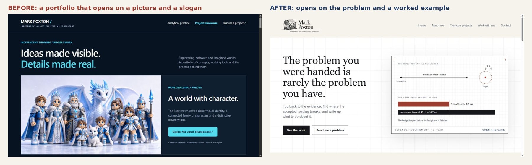
Mine did all three. It opened on a striking picture and a slogan, "Ideas made visible. Details made real." Every section used a different menu, and the case notes, which were the actual evidence, sat two or three clicks away.
The question
What stopped the old site doing its job, and what had to change?
What I found in the audit
Measured on the site's own files, before and after:
| Measure | Before | After |
|---|---|---|
| Different main menus across pages | 6 | 1 |
| Projects reachable in one click from the home page | 5 to 6 | 15 (all of them) |
| Words on the home page, longest version | 2,092 | 701 |
| Site files as published | 142 MB before optimisation | 62 MB |
| Organisation names in published case notes | named | anonymised |
What a first-time visitor met: 1. No clear audience. It spoke to clients and employers at once, so it spoke to neither. 2. Proof buried. The findings were inside case notes, not on the page you land on. 3. Inconsistent navigation. "Analytical practice", "Visual showcase", "Discuss a role", "All projects" and others, depending on the page. 4. A dark, heavy look that suited the visuals but not the analysis. Engineering clients read it as a games portfolio.
What I changed, and why
- One audience first. Clients first, employers second, as the owner decided. The hero now states the problem a client brings: "The problem you were handed is rarely the problem you have."
- A worked example in the first screen. A drawing shows a published defence requirement re-read in time: 3 m of travel at 340 m/s is 8.8 ms, against a 16.7 ms camera frame. The visitor sees the method before reading about it.
- Findings up front. A band of four headline numbers (17 vs 43, 74, +5.53%, 47 min), each linking to its case note.
- One menu everywhere, plus a project bar. Home, About me, Previous projects, Work with me, Contact. A strip under it links every one of the 15 projects.
- The same structure for every case note on the site. The problem, How it works, What it delivers, Where it stands, and a closing "Ask me about" prompt.
- A light "drawing sheet" theme. Paper background, ink, one blue and one red, a serif for headings and a faint grid, closer to an engineering drawing than a games launcher.
- Lighter pages. Images converted to JPEG and videos re-encoded, with no broken links.
- Anonymised. Hospitals, water companies, councils and suppliers in published work are now described, not named.
Checks before publishing
- Every page opened on phone and desktop widths.
- Every image and video reference checked against the files.
- Published 8 October 2026 as a single upload: 515 files, confirmed by the host.
What it means for a business
The same audit works on any professional services site: 1. Can a stranger tell in ten seconds what problem you solve, and for whom? 2. Is your best evidence on the first screen, or three clicks away? 3. Does every page use the same menu? 4. Is there one obvious next step? 5. How heavy is the site, and is any of the weight doing no work?
How I would run this for a client
- Week one: the audit above, with before screenshots and measures.
- Weeks two and three: the redesign and build.
- Before handover: the same measures run again, so the change is shown, not claimed.
- Fee: fixed, agreed when we scope it.
Limits
- There were no visitor analytics before the change, so enquiries and conversions cannot yet be compared. The case shows reasons and measures, not proven uplift.
- The subject is my own site. I was the designer, the builder and the client.
Sources
- Site files before each change, kept in the review-batch-02 backup folders
- The published site, 8 October 2026: https://markpoxton.com/