
Mark Poxton, independent analytical systems consultant

THE DECISIONS BEHIND THE WORK

Look closer.
Follow the reasoning.

I investigate unfamiliar problems in depth: find the data, compare alternatives, look for weaknesses and develop a system around what I learn. These projects show that process across software, engineering and research.

Beyond the first answer: nine further investigations ↗

A PRACTICAL WAY OF WORKING

Learn the field. Challenge the options. Develop the system.

I personally develop these projects. I find and interrogate the data, compare competing approaches, look for holes and opportunities, and bring existing technologies together into a coherent proposal or working platform. The transferable skill is learning enough about an unfamiliar problem to ask better questions and develop a practical response.

My contribution

The investigation, comparisons, challenges and development decisions are my work. I use AI as a tool in research, implementation and visual production, with the project direction and critical review led by me. Each case explains the problem I pursued and the system I developed.

Evidence you can examine

Links open selected recorded screens or public case material. Interface recordings, concept artwork and measured local results are identified separately. Original application source and private project material are not distributed.

01 / Operator software

XOP CNC controller

Watch the visual introduction ↗

My contribution

I designed and built the controller around the operator, not the machine: the preflight logic, the datum guard, the screen layout and the remote watch view. Every feature traces back to a real fault I hit while commissioning and running my own CNC router.

The problem

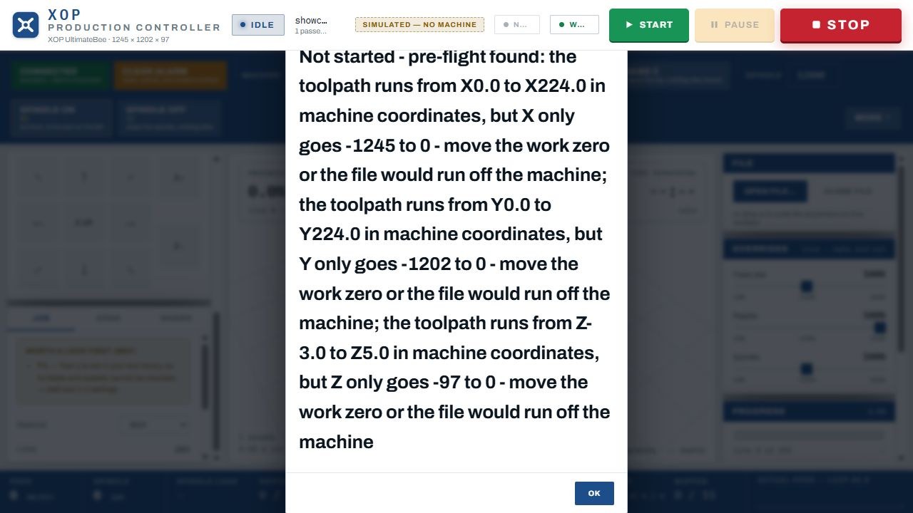
Standard CNC software sends the job and leaves the operator to spot the mistake, usually when the cutter is already in the material. A file that runs past the machine's travel, or a machine that quietly loses its work position, can ruin a part and the stock with it.

How it works

Before every run, the full toolpath is checked against the machine's real travel limits, and any job that would run off the bed is refused with the axis and distance shown. A datum guard watches for lost work position. A live 3D preview, spindle control, saved positions, calibration and job history sit on one screen. A direct USB link carries the job, while Wi-Fi lets a phone or tablet follow progress.

What it delivers

A controller built around the failure rather than the normal run. The recorded preflight scene shows a real out-of-range job being stopped before anything moves, with the exact overrun reported for each axis.

Where it stands

Implemented software. The recordings on this site come from a test environment with the machine disconnected, so they demonstrate the logic, not cutting accuracy.

ASK ME ABOUT

How the preflight check decides a job is unsafe, and what the operator sees when it does.

Back to project index ↑

02 / Desktop software development

Holly Suite

Explore eight applications ↗

My contribution

I developed Holly Suite end to end: the shared desktop foundation, all eight applications, the file-format handling and the test library behind it. The commercial case for replacing per-user licences is my own analysis.

The problem

Every organisation pays a monthly licence for every person who needs to write a letter or open a spreadsheet. Across a team, a small fee becomes a permanent operating cost, and the work most staff actually do is ordinary documents, sheets and slides.

How it works

Eight applications (Write, Sheets, Present, PDF, Draw, Photo, Web and Mail) run on one shared desktop foundation, each with its own window, icon and Windows identity, so the suite is maintained once rather than eight times. It opens and saves Word, Excel and PowerPoint files, and handles page layout, printing, undo, backup and recovery.

What it delivers

A working suite, version 1.17.0, checked by 45 test scripts and a PowerPoint test library covering text, shapes, pictures, tables and themes. A built-in calculator shows what per-user licences actually cost a team over time.

Where it stands

Working desktop suite. Compatibility varies by file format and is stated per format; older Word .doc files recover text but not original layout.

ASK ME ABOUT

Round-tripping a real Word or PowerPoint file, and where compatibility still falls short.

Back to project index ↑

03 / Engineering communication

MP1 — inside the form

Watch the visual introduction ↗

My contribution

I own MP1 from concept to cabinet: driver selection, the active electronics, the slicing of the 3D form into cuttable layers, the part-coding system and the CNC manufacture on my own machine.

The problem

A flowing, sculptural loudspeaker cannot be built from flat panels, and outsourcing a one-off form is slow and expensive. The cabinet still has to be rigid, sealed and acoustically correct inside, whatever the outside looks like.

How it works

Three premium drivers (a FaitalPRO 15-inch woofer, a Purifi 8-inch midrange and a Bliesma beryllium tweeter) each sit in their own sealed chamber, about 150 litres for the bass and 12 for the mid, with a digital crossover on Hypex amplifier modules. The 3D form is sliced into more than 80 layers of 18 mm MDF, each CNC-cut, coded so it fits only one place and one way up, and glued in strict build order.

What it delivers

A complete design-to-manufacture pipeline run in-house. The 3D viewer opens the cabinet chamber by chamber and layer by layer, linking the outside form to the internal structure and the cutting files.

Where it stands

In manufacture. The first cabinet is being cut and assembled; acoustic measurement follows completion.

ASK ME ABOUT

How a 3D form becomes 80-plus numbered layers that can only go together one way.

Back to project index ↑

04 / Mission software

ABYSS mission control

Watch the visual introduction ↗

My contribution

I designed the mission concept and built the operator software: the mission types, the screen layout, the alert workflow and the end-of-mission report.

The problem

With several autonomous aircraft flying at once, the operator is buried in separate feeds for position, battery, video and messages, and can miss the one alert that matters.

How it works

The software is organised around the mission lifecycle: plan, follow, intervene, review. The operator chooses tunnel mapping, search and rescue, or multi-aircraft site patrol with offset sweep sectors. Every aircraft's coverage, position, battery, energy needed to return home, and link quality appear on one screen, and an alert takes the operator straight to the observation and the decision.

What it delivers

A complete operator workflow, from mission plan to report. The recorded scenes show mapping, a patrol alert being handled and the finished mission report.

Where it stands

Implemented software, demonstrated with generated aircraft and sensor data. Integration with real aircraft is the next stage.

ASK ME ABOUT

How an alert moves from detection to operator decision to the mission report.

Back to project index ↑

05 / Whole-system design

OCUM underwater survey

Watch the visual introduction ↗

My contribution

I framed the problem, compared the available survey approaches, designed the system and its operating model, costed it end to end, and wrote the submission.

The problem

Rivers and lakes in many countries still hold unexploded ordnance. Survey is expensive because it needs a boat, a crew and people on contaminated water, and in many affected places there is no boat to hire at any price.

How it works

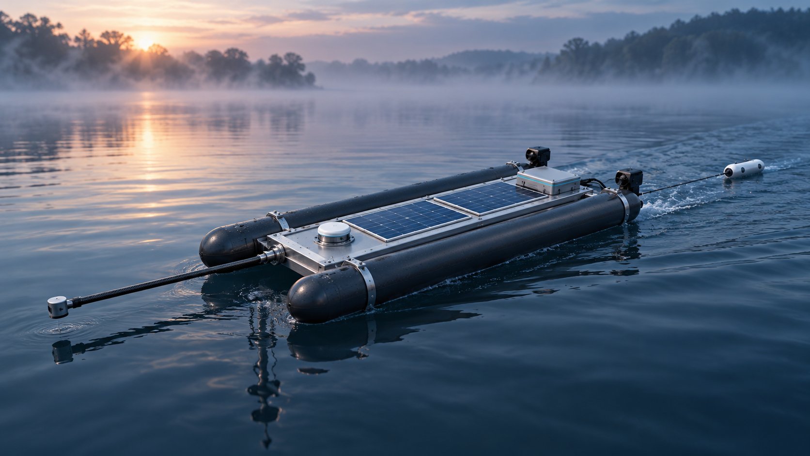
One operator launches a small autonomous vessel from the bank, so nobody goes on the water. It runs a planned survey pattern while a magnetometer records anything that disturbs the local magnetic field, then returns with a geolocated map in the format clearance teams already use. It is built on proven open-source autopilot software and commodity parts, so nothing rests on unproven technology.

What it delivers

Costed as a whole operation (vessel, sensing, deployment, coverage and handover) rather than as a sensor, at a fraction of the challenge's cost ceiling. The submission reached the final evaluation stage of a United Nations Development Programme challenge.

Where it stands

Final evaluation stage; not selected for award. The full submitted document is published on this site. Field validation would be the next step.

ASK ME ABOUT

Why the cost of the whole operation, not the sensor, decided the design.

Back to project index ↑

06 / Data interpretation

F1 telemetry analysis

Watch the visual introduction ↗

My contribution

I built the season database, chose the teammate method, designed the corner-phase analysis and the lap replay, and stress-tested what the public data can and cannot support.

The problem

Lap times say who was faster, not where or why. The teammate is the ideal control group (same car, same team, same weekend), so any consistent gap between them is the driver.

How it works

Every free public data source for the 2026 season is loaded into a high-speed analytical database (DuckDB on Parquet files), with full telemetry for every session. Each corner is split into braking, turn-in, apex and exit, and the two drivers are compared phase by phase. A lap replay ties the car's movement to throttle, brake, gear and speed.

What it delivers

A season-wide, reproducible teammate comparison. 1,285 straight-line records were reconciled to establish which comparisons the public sampling supports, rather than assuming it supports them all.

Where it stands

Working database and analysis of public data. It is not a live feed and uses no private team data.

ASK ME ABOUT

What public telemetry can and cannot prove about a driver.

Back to project index ↑

07 / Local AI evaluation

Jarvis assistant & laboratory

Watch the visual introduction ↗

My contribution

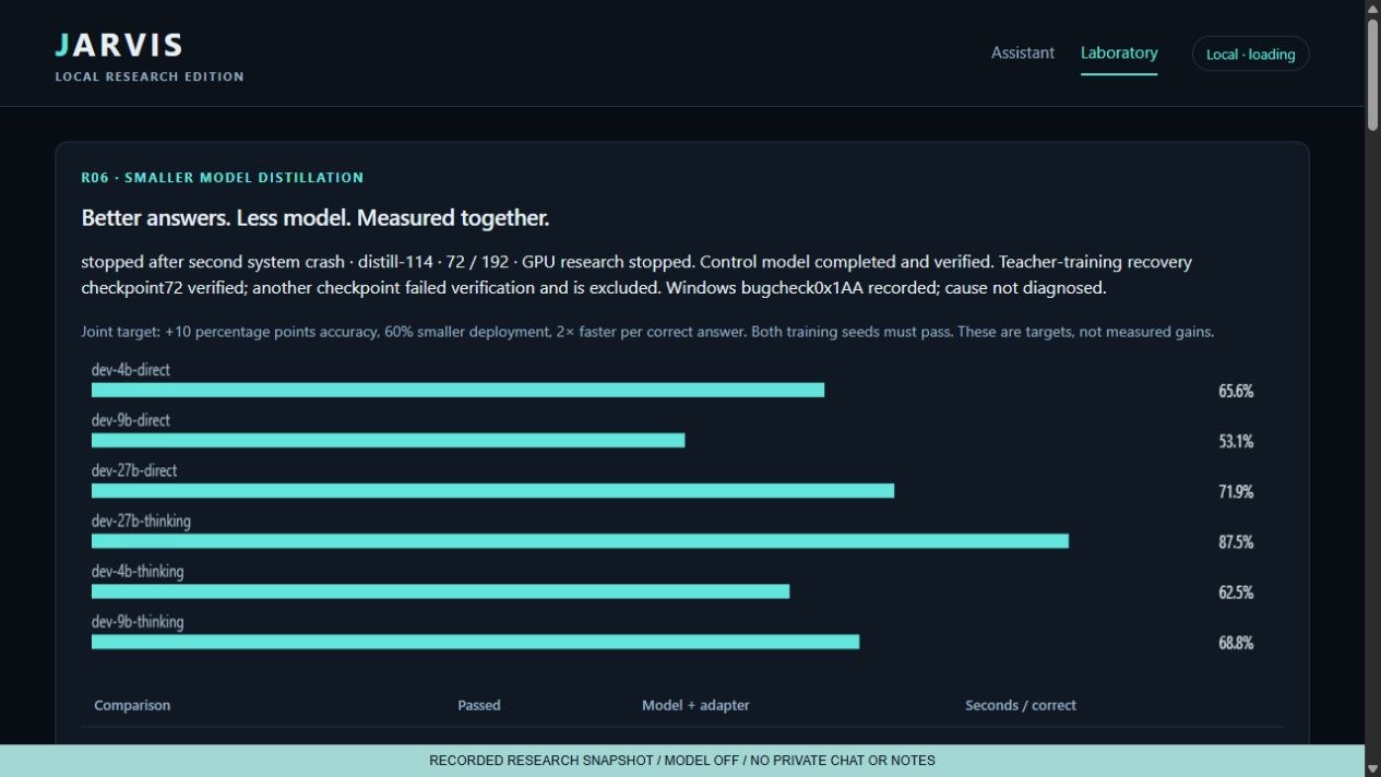
I built the assistant and its laboratory, set the evaluation method, ran the model comparisons and distillation experiments, and made the model choices from the recorded results.

The problem

Running AI privately means choosing a model that fits the hardware. Bigger models are smarter but slower, and choosing on reputation alone means guessing.

How it works

The assistant runs entirely on one workstation: no data centre, and no data leaves the building. Candidate models run the same set of test cases and are scored on correctness and response time, and every result is kept as a permanent record. Distillation experiments train smaller models to match larger ones.

What it delivers

A model choice made on evidence rather than reputation. In one recorded run, a 27-billion-parameter model passed 15 of 15 cases at a 20.86-second median, while a faster model passed 14 of 15 at 9.65 seconds.

Where it stands

Working assistant and laboratory. Results come from local test sets, not public benchmarks.

A concrete trade-off

Saved local run · 10 September 2026 · 15 cases per model
ModelCases passedMedian response
27B15 / 1520.86 seconds
35B-A3B14 / 159.65 seconds

The faster model passed one fewer case. This small run exposes a decision; it does not establish a universal winner. Source: saved QWEN-THINKING evaluation, run 20260910T215015Z, checked against the local results file.

ASK ME ABOUT

When the faster model is the right choice, and how the next evaluation should be designed.

Back to project index ↑

08 / Research information design

Cancer research & Alpha intelligence

Watch the visual introduction ↗

My contribution

I set the research direction and designed the discovery pipeline: what data is gathered, how it is stored and linked, how compounds are compared and screened, and how each candidate's evidence trail is kept for the scientist who tests it.

The problem

Wet-lab testing is slow and expensive, and most candidates fail. Yet the evidence that could rule many of them out, or flag a promising combination, is already published, scattered across thousands of sources nobody can read in full.

How it works

Alpha collects as much published evidence as it can reach (studies, trial registries, compound records, mechanisms and outcomes) and loads it into high-speed analytical databases and a knowledge graph. It compares compounds against each other and in combination, weighing everything held on each one: target, dose, patient group, side effects and contradictory results. Systematic screening then surfaces candidate matches and ranks them.

What it delivers

A ranked shortlist ready for wet-lab testing, with every candidate carrying its complete evidence trail. The recorded screens show the knowledge graph, the evidence view and the validation command that sit behind that pipeline.

Where it stands

In development. The output is a shortlist for laboratory testing, not a proven treatment. The DNA animation is an introduction, not a biological model.

ASK ME ABOUT

How a compound moves from raw published data to a ranked candidate with its evidence trail.

Back to project index ↑

09 / Research controls

Colosseum trading research

Watch the visual introduction ↗

My contribution

I built the research workspace, defined the evidence gates, rebuilt the strategy tests from public filings, and kept the full record of results, including every losing one.

The problem

Most trading ideas look profitable until the costs, the timing and the losing trades are counted. Picking the best-looking backtest is how money gets lost.

How it works

Colosseum takes public company filings and market prices and rebuilds every trade from the moment the information became public. Each strategy is measured against a matched comparison, not against zero. Strategies move through compare, challenge and review gates, and any survivor is frozen and tested on unseen data before it can qualify.

What it delivers

Of 50 variations tested, 20 lost money, and the most attractive one relied on a price that was not available at the time. The process caught it before any capital was at risk.

Where it stands

Research platform shown through recorded screens. No profitable strategy or live trading is claimed.

ASK ME ABOUT

Why the best-looking result failed, and why the losing results are kept.

Back to project index ↑

10 / Focused software design

Kraken market visualizer

Watch the visual introduction ↗

My contribution

I took a plain requirement (one market to follow, and a quick way to see how the others are doing against it) and designed and built the solution: the screen, the comparison logic and the local data service behind it.

The requirement

The requirement was a market screen that someone who is not a trader could read at a glance. Standard trading terminals show everything at once, which makes it hard to see how the rest of the market is moving against the one that matters.

The solution

Bitcoin sits on one clear reference chart, and any of eight other markets opens beside it with one click. All nine are ranked daily and compared on one scale over a day, a week or a month, priced in US dollars so currency moves cannot distort the result. A local data service queues and caches requests to the exchange's public data, refreshing prices every 15 seconds and history every minute.

What it delivers

A read-only screen that answers one question instantly: how is everything moving against Bitcoin? The comparison scenes show each market laid alongside the reference.

Where it stands

Working local application using live public market data. Read-only by design; it cannot place a trade.

ASK ME ABOUT

Why every comparison is priced in dollars, and how delayed data is flagged.

Back to project index ↑

11 / Engineering feasibility

Family VTOL

Watch the visual introduction ↗

My contribution

I set the brief, chose the architecture, researched the components and ran the energy checks that decide which ideas survive into the design.

The problem

Helicopters depend on a gearbox, a main rotor and a tail rotor, any one of which can bring the aircraft down. The brief was a four-seat family aircraft for a 1,900 km trip from Staffordshire to southern Spain, with as few single points of failure as possible.

How it works

Tilting wings point up to lift off like a drone, then rotate forward to cruise like a plane. Eight rotors in protective rings drive it, with no gearbox and no single rotor whose loss is fatal. Two independent electrical systems are fed by two automotive diesel generators running on aviation fuel and backed by batteries, with a whole-aircraft parachute, flotation and landing airbags as further safety layers.

What it delivers

A coherent four-seat concept in which every claim is checked against the physics first. That check rejected an early idea of recharging the battery on descent: a 150 m drop yields about 0.47 kWh against the 2.5 kWh needed.

Where it stands

Design and feasibility study. It is not a flying aircraft; detailed engineering and certification would follow.

ASK ME ABOUT

Which assumption decides whether the aircraft closes its energy budget.

Back to project index ↑

12 / Systems development

TADS systems development

Watch the visual introduction ↗

My contribution

I developed TADS from no prior knowledge of the sector. I sought out the data, compared hundreds of alternatives, challenged the weaknesses, assessed the proposal against current UK military systems, and wrote the 56-document submission pack.

The problem

Could existing, proven technology be combined into a better national air defence system, and could the proposal be made traceable enough for a reviewer to judge it?

How it works

The field was researched from public sources and hundreds of alternative approaches were compared. The chosen architecture was then set out with its dependencies, evidence requirements and costed delivery stages, so a reviewer can follow the path from concept to delivery and see what each stage relies on.

What it delivers

A 56-document submission pack, including system architecture and a 90-day delivery plan, built from a standing start in an unfamiliar sector. A later evidence review separated what the documents prove from what they propose.

Where it stands

Written proposal and evidence review. Not a tested or contracted system.

ASK ME ABOUT

How hundreds of options were narrowed to one architecture.

Back to project index ↑

13 / Longitudinal analysis

Longitudinal health research

Watch the visual introduction ↗

My contribution

I designed the analysis, audited the sample, built the three comparison views and ran the robustness checks behind the headline finding.

The problem

Population averages hide what happens to an individual. Two women can follow opposite paths through menopause and still produce a flat average that describes neither of them.

How it works

The project reanalyses a major long-running study that follows the same women across repeated clinic visits. It compares three views: by age, aligned to each woman's own transition, and change within the same person. The sample is audited before anything is reported, and the headline finding is tested against seven ways of coding the outcome.

What it delivers

From 28,743 eligible records to 10,656 complete visits from 2,370 women, with every exclusion shown. The main association survived the robustness checks, and the alternative codings are reported beside it rather than hidden.

Where it stands

Research reanalysis of published study data. Not a diagnosis or treatment service; the illustrative imagery is not measured data.

ASK ME ABOUT

Why the sample audit matters as much as the headline result.

Back to project index ↑

14 / System communication

Agent Field

Watch the visual introduction ↗

My contribution

I designed and built the visualisation: the agent groupings, the way work travels between them, and the signals that show where activity builds up.

The problem

When dozens of AI agents work together, their logs scroll past too fast for anyone to supervise, and a stalled team is easy to miss.

How it works

Agents are grouped by job (scout, extract, verify, model, build and watch), and work items visibly travel between groups. Busy teams, idle teams and bottlenecks show up at a glance, so a supervisor can see the system's shape without reading a log.

What it delivers

An interface that turns invisible automated activity into something a person can supervise in real time.

Where it stands

Working visual system, shown with demonstration data rather than measured production workloads.

ASK ME ABOUT

What each signal on the map means, and what you would add to measure real work.

Back to project index ↑

15 / Creative development

Aurora Worlds

Watch the visual introduction ↗

My contribution

I led the creative direction: the Frostcrown cast, the visual identity of their world, the animation studies and the browser prototype.

The problem

A game world needs a coherent visual identity before it can become a coherent experience, and early characters rarely survive first contact unchanged.

How it works

The Frostcrown cast and their frozen kingdom were developed through successive versions, from concept art to a connected family of characters. Animation studies brought them to life, and a browser prototype lets a player choose and explore worlds.

What it delivers

The full creative chain on show, from concept to character to motion to a working prototype, with the progression between versions visible.

Where it stands

Creative development and prototype. The characters are not yet integrated into a finished game.

ASK ME ABOUT

How the characters changed between versions, and why.

Back to project index ↑

CONTINUE THE CONVERSATION

Bring a real problem.
Ask me to work through it.

A focused discussion can explore requirements, design decisions, alternatives and how I would establish a useful result in your team.

Discuss a role or project ↗

BEYOND THE FIRST ANSWER

The wider research programme.

Nine investigations into data quality, model behaviour, environmental comparisons, operating systems and commercial decisions. See the research and judgement behind the result.

Explore nine further investigations ↗